Why Redesign Instagram?
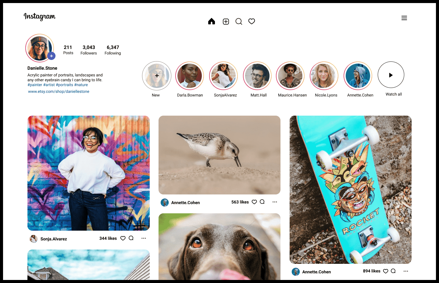
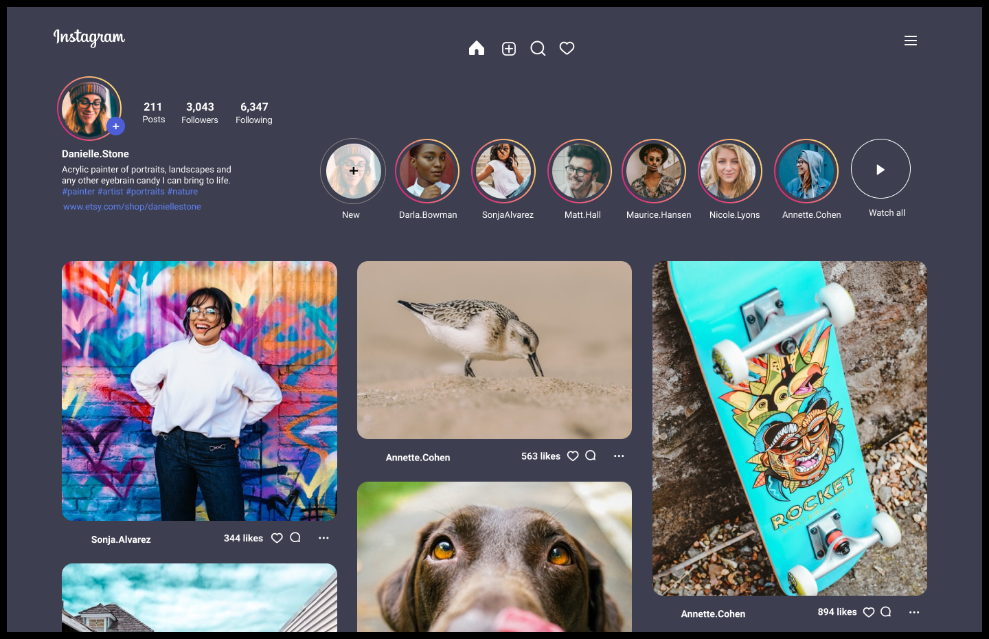
I often wondered why the Instagram desktop design was so different compared to their mobile version. I think their mobile version is amazing. And a desktop redesign would be a worthwhile, fun challenge. I decided to move forward with a new redesign using my diverse skill set and best practices for UX/UI design.
My Thoughts About Good UX/UI Design
My philosophy about good UI/UX design is pretty simple… each element of a design needs to be united, both visually and in purpose and is fluid on all devices. Clarity is also key. I asked myself a number of questions throughout the process. Does this belong here? What problem does this solve? How else could I place this? I didn’t challenge the Instagram UI elements but reorganized the structure and added features from the Instagram mobile version for a more enriching user experience on desktop.
App used: Figma
Plugins: Iconify, Unsplash
"My philosophy about good UI design is pretty simple... each element of a design needs to be united, both visually and in purpose."
Instagram Desktop
Before I started the redesign, I wondered if there were enough desktop users for Instagram to make it worthwhile. And there is. As of June 2021, the United States generated 18.71 percent of desktop traffic to Instagram.com. Now if you divide 115 million Instagram users in the US by 18.71, that’s a lot of users. 21,151,650 to be exact.
History
A closer look at Instagram
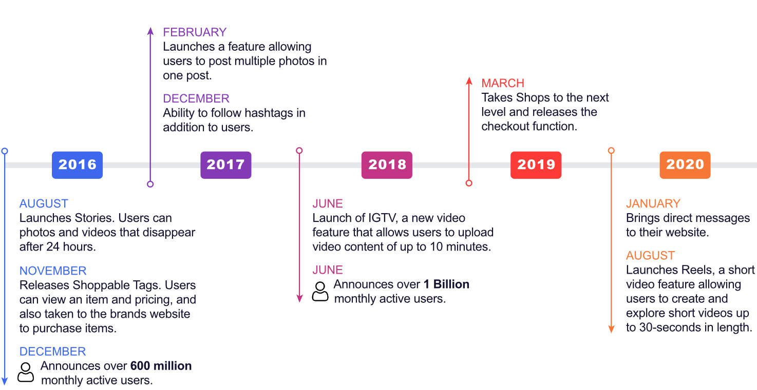
As of June 2018, there were 1 billion monthly active users on Instagram.
1 Billion is a big number, and it positions Instagram behind Facebook (2.8 billion) but ahead of most other social network sites, including Twitter (which has a “reachable” audience of 353 million) and Pinterest (459 million). Below is a snapshot of the Instagram’s major upgrades and growth in the last 5 years.
Key insights
Since 2010, Instagram has been in competition with TikTok, Pinterest, Snap, and Twitter, and others. And producing innovative technology themselves. Their business strategy shaped my redesign decisions and expanded my understanding of their business model. I realized that implementing the most current UX/UI best practices regarding functionality and design was vital to their brand and business objectives.
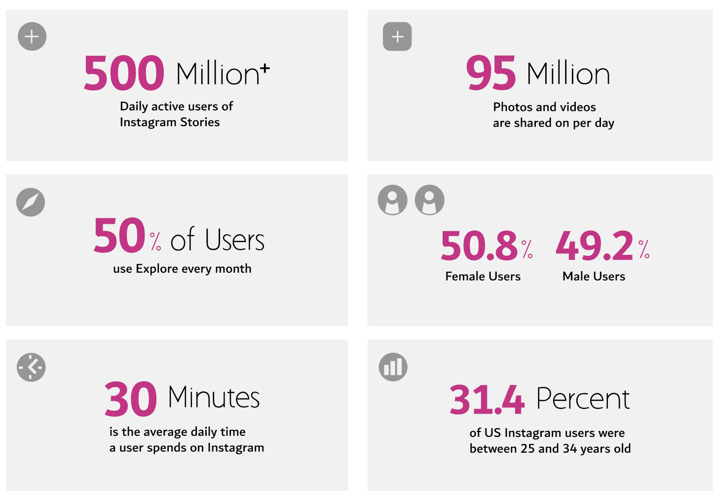
Statistics
Part of my redesign plan was to know the latest facts about Instagram. This guided my UI design in terms of which features were used most often. And needed to be included in the redesign interface. The statistics also gave me a clear idea of instagram’s demographic. This also helped me with choosing the right candidates for my usability testing.
Usability Testing
Participants
I recruited 24 participants between the ages of 25 and 34 years of age, the largest demographic of Instagram users. This demographic consists of 31.4% percent of Instagram market share. The majority of participants (20) never used the desktop app and the ones that did (4) only tried it once. All of them used Instagram on their phones for at least 20 minutes per day. More than half (14) were posting photos or video daily. Although I gleaned some valuable feedback from these surveys. I also received significant insights from participant responses when I asked open-ended questions.
Survey methods
I did a survey of 24 Instagram mobile users, in combination with more in-depth interviews where I needed to gather additional details.
My goal was to identify how comfortable users were using the current Instagram desktop interface. I was particularly interested in knowing if the UI was easy to access, understand, and use. And to get their feedback about what could be improved.
I used a survey with a total of 12 questions and after each individual completed the survey, I would ask a number of open ended questions. A sample of survey questions are below.
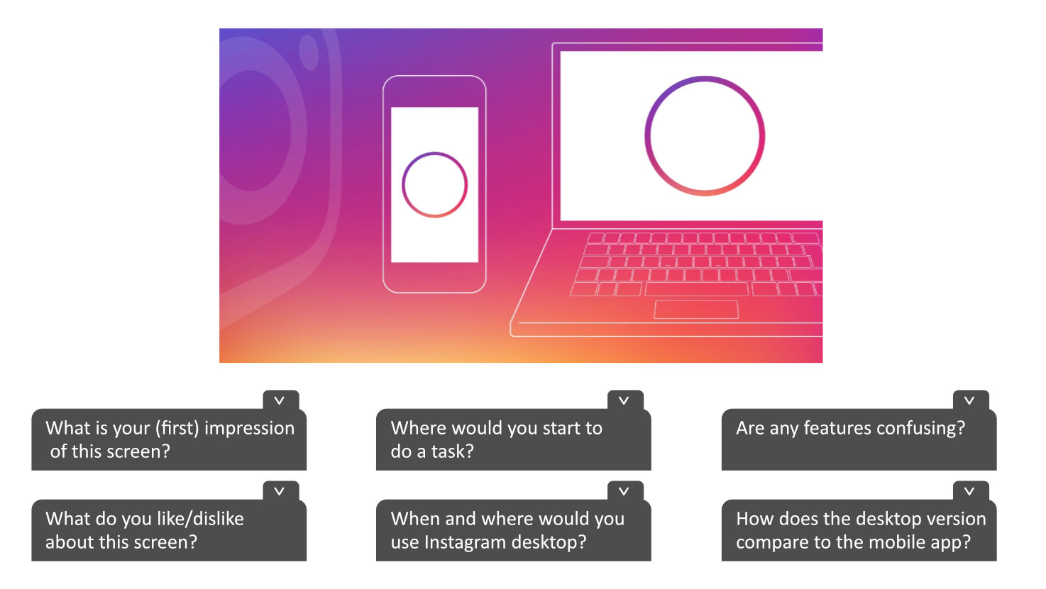
Survey developed with
![]()
Open-ended Questions
The most valuable feedback I received was during the open-ended questions. Individual responses were very personal and I was able to understand why specific things mattered to them. Some of the key user observations are below.

“The “new” desktop Instagram is one that’s just a web wrapper around mobile.”
“It looks like you blew up a phone onto your screen.”
“I have business and want to post product photos from my desktop so why use it when I can’t?”
“Mobile is better. The photo may be physically bigger on a desktop monitor, but it's too big.”
“The desktop is too limited. I can do so much more on mobile.”
Data results
My UX research clearly revealed the user’s needs and directed how my UI was organized, enhanced, and designed. The hotjar data below was able to identify what users wanted in terms of the features and design of the current Instagram interface page. It was clear that the the interface needed to be redesigned plus existing features from the mobile app needed to be added. By measuring these results, I was able to determine how to increase user engagement and pinpoint what changes needed implemention.
Would you use Instagram desktop if the interface was improved?
Would you use Instagram desktop if more features were added?
Data measured with
![]()
Introducing The Redesign
Overall, visual balance and uniformity was implemented. I relied heavily on the research when reorganizing my UI components. Design patterns followed more desktop practices than mobile as in Instagram’s current interface.
I couldn’t resist doing the light and dark redesign concept from the start. Most new products are rethinking bland white and instead embracing light and dark mode designs. High contrast (as shown in the dark mode) also provides great opportunities for super dramatic photos and videos. Aside from that, research has shown that dark mode usage is at an all time high.
In the next section, I demonstrate a side-by-side comparison of problems of the existing design versus the improvements of the redesign.
Rethinking Design
A comparison of both versions and implementing best practices
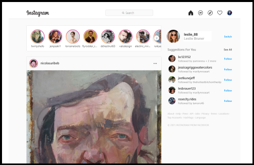
Current Design

Upgraded Design
Problem: Main image extends below screen
The screen is confined to one image post, requiring the user to scroll to view full image.
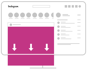
Solution:
Used the desktop space for more image posts to capture user engagement.

Problem: Overlapping grids and sections
The usage of overlaying a mobile grid for desktop produces results that make the design look crowded and difficult to understand.
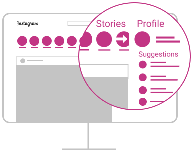
Solution:
Used best practices of desktop grid design to delineate sections and balance elements.

Problem: UI doesn’t match the research
UI elements that don’t reflect current users needs according to statistics and research.
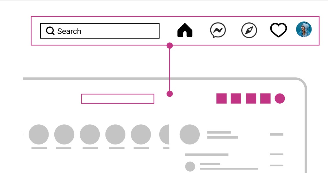
Solution:
Icon placement is in line with users needs and corresponds with the data.

Final Thoughts
Using a combination of optimizing the desktop grid, but also keeping the integrity of Instagram’s branding and existing UI, I was able to make major improvements to their current interface design. I also stuck very closely to the research and data while making decisions about placement and revisions of UI elements.
As always, I’m mindful of users with disabilities too. I switched the layout orientation to display left-to-right so those users could comprehend the words and flow easier.
